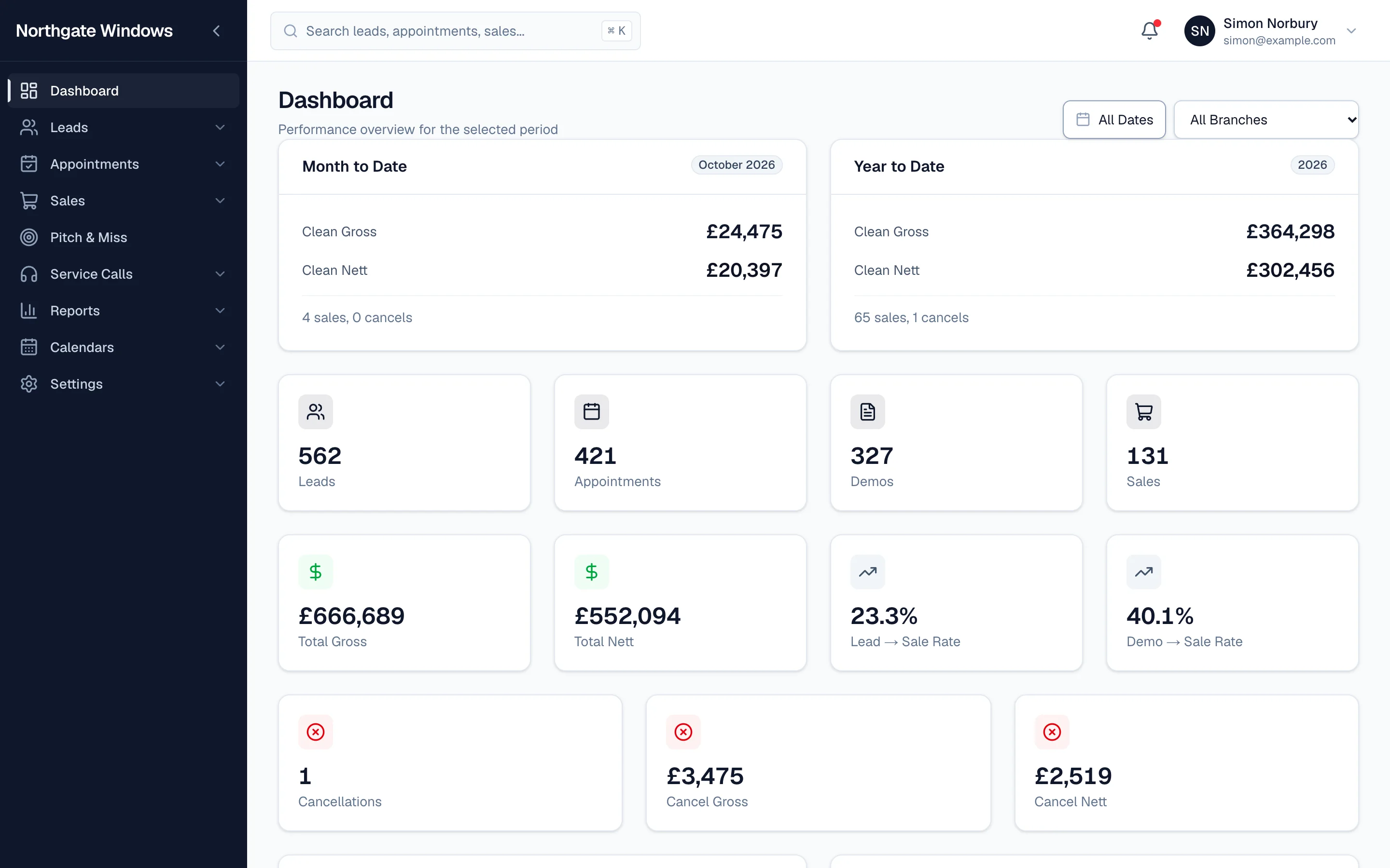
Software you use all day should be calm to look at. We've given GlazingCRM a cleaner, quieter design that puts your information first.
What's changed
- Neutral greys and whites throughout, so the numbers and the customer stand out rather than the buttons.
- One accent colour — yours. Set your brand colour in settings and it's used for buttons, highlights and the active menu item across the whole system.
- Status colours that mean something. Green, amber and red are kept for good news, things to watch and problems, so they catch your eye for the right reasons.
- Tidier lists and forms, with more room for the information that matters.
Your name on it
Your company name sits at the top of the menu, and your team signs in at your own web address. To your staff, it's simply your system.
Nothing to relearn
Everything is where it was. Menus, buttons and screens work exactly as before — they just look better doing it.